Variables in Webflow: Everything you need to know
Key Takeaways
- Modes let you define values for light, dark, or seasonal themes and switch them site-wide in one click.
- Functions like
clamp(),min(), andmax()make it easy to set fluid, responsive values without custom code. - Multi-type variables cover colors, typography, spacing, dimensions, and even fonts — making design systems fully tokenized.
- Design token syncs with tools like Figma reduce manual setup and keep design and development aligned.
- Improved management features like groups, search, and aliases make scaling variables across large projects easier.
If you’ve ever had to manually change values like background-color or border-radius across multiple classes and pages, you’ll know how time-consuming it can be. Variables in Webflow solve this by letting you define values once and reuse them everywhere. Update the variable, and every linked element updates instantly.
Today, variables in Webflow go beyond simple color or spacing tokens. They support modes (like light and dark themes), functions (clamp(), min(), max() for fluid design), and even design token syncs from Figma. This makes them a core part of building scalable, future-ready design systems.
In this blog, we’ll cover everything you need to know about Webflow variables in 2025, from creating your first variable to managing them in groups, applying modes, and using advanced functions. We’ll also share best practices and examples so you can confidently integrate variables into your workflow.
By the end of this guide, you’ll be able to use variables as fluently as classes, but with the added speed, consistency, and flexibility that modern Webflow projects demand.
Understanding variables in Webflow
To set the full context, let’s understand what Webflow variables are, and how are they different from global classes.
What are variables?
Variables in Webflow are reusable values you define once and apply across your project. When you update a variable, every element linked to it updates automatically, keeping your design consistent and easy to manage.
You can create variables for:
- Colors – build palettes and manage brand consistency.
- Typography – set font sizes, line heights, or type scales.
- Spacing & dimensions – control padding, margins, and widths.
- Fonts – keep text styles aligned with your design system.
Webflow also supports:
- Modes – define different values like light, dark, or seasonal themes, and switch them site-wide.
- Functions – use
clamp(),min(), ormax()for fluid and responsive design. - Design token syncs – connect with tools like Figma to keep design and build in sync.
Variables help you scale faster, collaborate better, and maintain a future-ready design system.
Difference between variables and global classes
Variables and global classes both help maintain consistency in your design, but they serve different roles.
- Variables are reusable values you define once and apply across your project. When you update a variable, every element linked to it updates automatically. They’re ideal for properties like colors, sizes, and fonts that often need site-wide changes.
- Global classes are sets of styles applied to specific elements. When you update the class, all elements using it inherit those changes. Classes work best for controlling the overall styling and layout of recurring components.
In practice, variables are best for managing reusable values, while classes ensure structural and stylistic consistency across elements. Together, they create a more efficient and scalable workflow.
Getting Started with Variables
Now that you understand what variables are and how they are different from global classes, let’s create and implement your very first variable.
Creating Your First Variable
Let’s create a color variable for your project to keep things simple. We will create a primary, secondary, and a background color variable
Here’s how you can create your first variable in webflow -
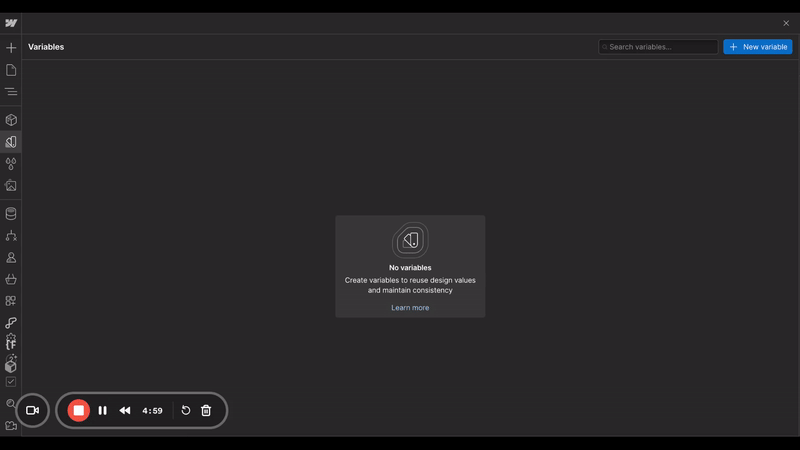
Step 1: Navigate to variables(or press V) in your webflow Designer
Step 2: Click the “+ New Variable” button. and choose color from the dropdown.
Step 3: Enter color/text-primary as the name of your variable, and choose the color from the color picker. Naming it this way will put the variable ‘text-primary’ under the folder ‘color’. This allows you to organise your variables properly.
Step 4: Congrats! you’ve made your first variable. Repeat this process and make variables for text-secondary and background.
Applying Variables to Elements
Now that your variables are defined, it’s time to apply them to your website.
Step 1: Select the element you want to style. This could be text, a button, a background, or any other element.
Step 2: Go to the Style panel (or press S) on the right-hand side of the Webflow Designer.
Step 3: To change the text color, go to the Typography section, click on the color field, and select the text-primary variable from the color picker.
Step 4: For the background color, go to the Backgrounds section, click on the color field, and choose the background variable.
Step 5: Do the same for rest of the classes that need to have same text and background colors.
Great! You have connected your website colors with variables. But there’s nothing special about it yet, right?
But let’s say you want to change the primary text color from black to blue throughout the website, on all headings, buttons, and content.
To do this in a normal scenario, you’d need to update the color on all heading classes, button classes, paragraphs, or parent classes wherever you had assigned a text color. That would take a lot of time.
Not this time! Now that you’ve connected everything with the variable text-primary, you only need to change the value of text-primary on the variables panel, and it’ll update on your entire website, across all classes.
This is the power of Variables.
You can create, apply and update variables in the same way for font sizes, spacings, paddings, card radiuses, and even interactions. The possibilities are truly endless here.
Managing variables in your projects
Now that you understand how to work with variables, let’s take it up a level. To make your projects better organized, and easier to manage & scale, there are a few techniques that you can use. We’ll show them to you here -
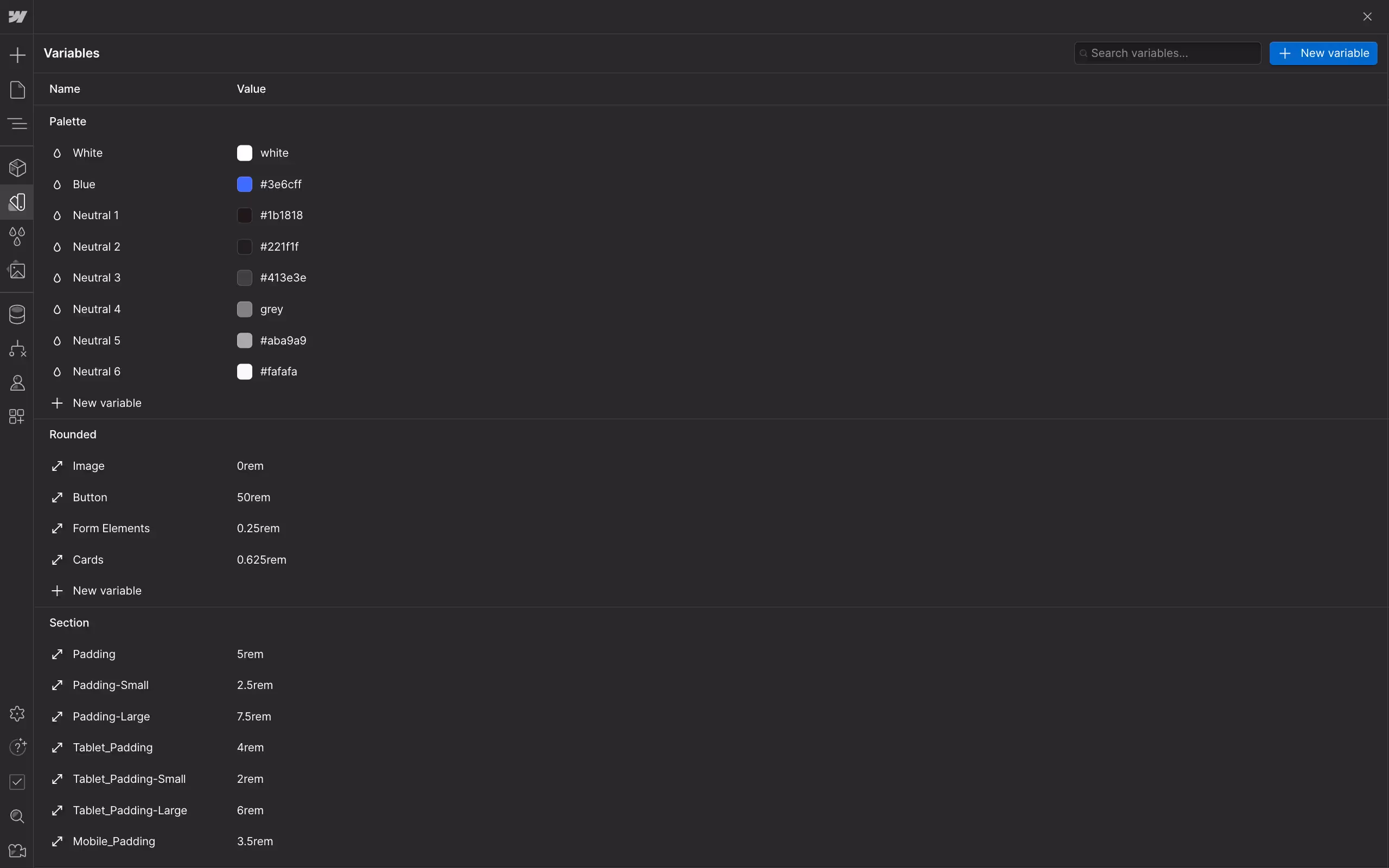
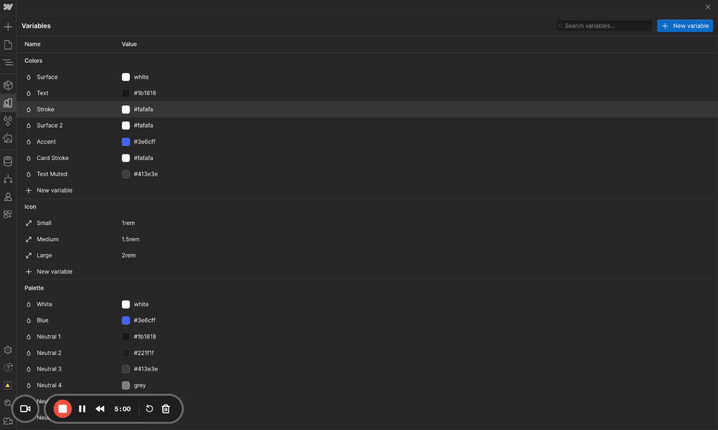
Organizing Variables into Groups
Creating and managing variable groups will help you keep your project organized and ensure that you can quickly find and update any variable when needed.
When naming your variable, use a clear and descriptive naming convention that includes a group name. For example, color/text-primary and color/background that we used earlier, will automatically organize your variables into a "color" group with nested variables.
Once you’ve organised your variables, it should look something like this.
Using Aliases
Aliases allow you to reference the value of one variable in another, so when you update the linked variable, all aliases will update automatically. This speeds up your workflow even more. Here’s how you can create and update aliases in variables -
1. Create an Alias:
In the Variables panel, create a new variable as you normally would. Instead of setting a value, click on the alias icon(dot on right) and select the existing variable you want to reference.
2. Update Aliases:
To update the aliases, just update the original variable, and all aliases referencing it will update automatically. This is great for maintaining a consistent design system without manually updating each related variable.
Where can you use variables
Now that you understand how variables can created and managed, let’s see where and how you can use them in your real-life projects -
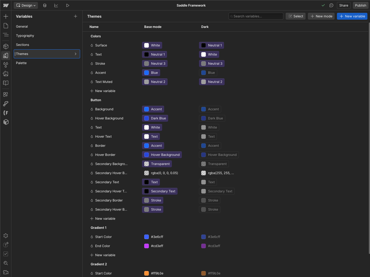
Theming and site styles
You can set up the entire theme of your website and manage it from the variables panel in Webflow. If configured correctly, everything from fonts, font sizes, common spacings, and radiuses, to background, border, and text colors can be managed within the variables panel.
You can even take it a step further and make changes across all elements together with a little bit of CSS.
For example, if you want to create a dark theme for your page or section, instead of having to change values for every color, background, and border manually, you can create a class that changes a page or section into dark mode with this CSS:
.dark-theme {
  --color-text-primary: var(--white);
  --color-background: var(--black);
  --color-text-secondary: var(--grey);
}
And if you are wondering where can you find the CSS variable to put here, you can click on the settings icon that appears on the variable on hover, and you’ll see the CSS value below.
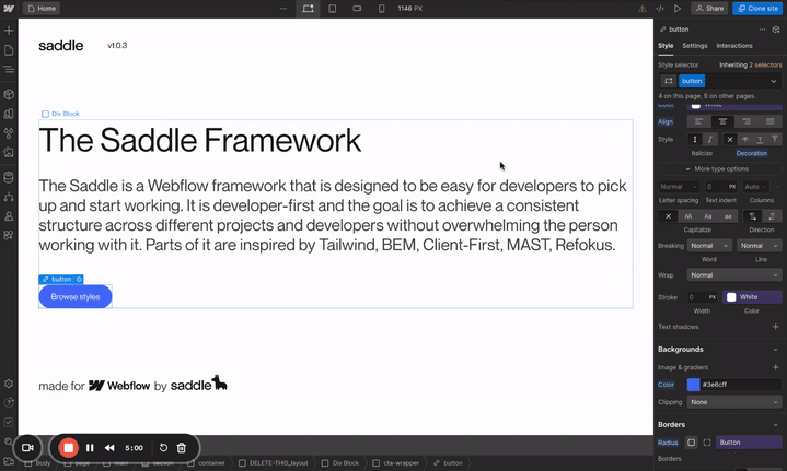
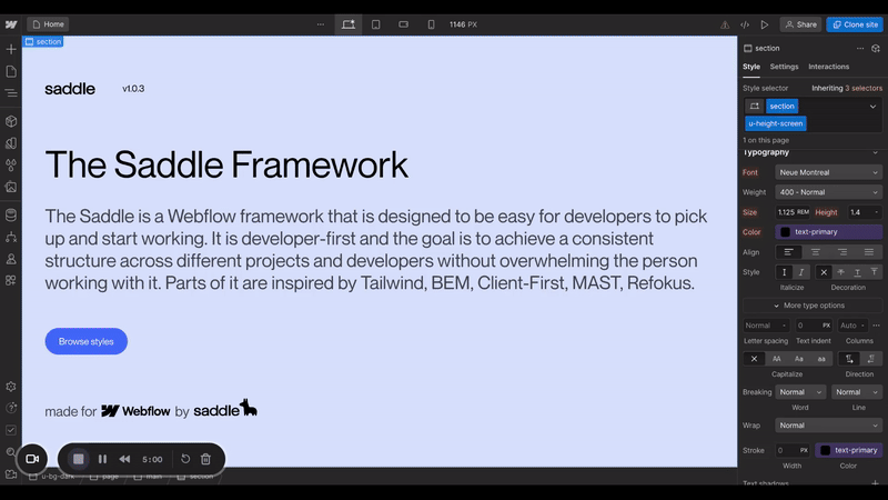
Pro tip: If you want a good starting point, you can use the saddle framework to begin your projects with pre-build variables and aliases.
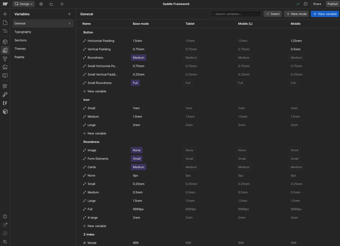
Responsive design with variables
You can define variables for different font sizes and spacing values based on screen size. This would ensure your site looks great on any device.
For example, you can create a variable for Padding, Tablet_Padding, and Mobile_Padding. Once you apply these variables to your elements for different breakpoints, the padding will automatically adjust as the screen size changes.
You can do this manually, but there’s a better way too. If you are a comfortable with using a little CSS, you can adjust the switch from Padding, to Tablet_Padding and Mobile_Padding on different screen sizes, without having to manually set it on every breakpoint in your classes.
To make this process easy, make sure you have a main variable that you’ll add on the class(like we have Padding here). We’ll then update the value of this main variable based on screen sizes.
Here’s how you can write the media query for it -
 <style>
/* tablet */
@media screen and (max-width: 991px) {
  :root {
    --section--padding: var(--section--tablet_padding);
  }
}
/* mobile landscape & portrait */
@media screen and (max-width: 767px) {
  :root {
  	    --section--padding: var(--section--mobile_padding);
  }
}
</style>
This will make sure your variables values automatically update as you go from desktop to tablet or mobile.
Set the responsive sizes for your border radius, margins, font sizes etc in the same way. And once you’ve done this, you can go back and manage the changes in the variables panel again. You won’t need to edit anything here as long as the variable names remain same.
Variables in animations and interactions
You can use variables in your animations and interactions as well. You can bind variables to properties like color changes on page scroll or element transformations, and change your entire website’s color scheme on scroll with just a few clicks. This video shows how you can do it.
You can also animate things like SVG paths with Variables. This video shows how to do it in a very simple way.
The more you experiment with variables, the more handy you’ll get when using them.
What’s new in 2025 in Variables
Webflow Variables have grown into a complete design management system. Beyond basic tokens, you can now create themes, set responsive values, and sync directly with your design tools. Here are the most important features you’ll want to start using in your projects:
1. Variable Modes
Modes let you assign multiple values to the same variable and switch them site-wide.
- Example: a
--brand-primarycolor variable can have a value for Light Mode and a different value for Dark Mode. - Switching the site mode instantly updates every element linked to that variable.
- This is useful for brand rebrands, seasonal campaigns, or accessibility-friendly themes.
2. Functions in Variables
Variables now support native CSS functions like clamp(), min(), and max(). These allow you to set fluid, responsive values without writing custom code. You can also add custom value amd calculations here.
- Clamp: Create responsive font sizes that scale between a minimum and maximum.
- Example:
clamp(1rem, 2vw, 2rem)adjusts font size smoothly across breakpoints.
- Example:
- Min/Max: Set boundaries for spacing or dimensions so values never shrink or expand beyond what’s intended.

3. Multi-Type Variables
You’re no longer limited to just colors. Webflow supports variables for:
- Colors (primary, secondary, backgrounds, gradients)
- Typography (font sizes, line heights, letter spacing)
- Spacing and dimensions (padding, margins, widths)
- Fonts (for keeping text styles consistent with your design system)
4. Design Token Syncs
Variables now connect more smoothly with tools like Figma. You can import design tokens (like colors, typography scales, or spacing systems) and map them directly into Webflow variables. This reduces manual setup and keeps design/dev teams aligned.
5. Improved Variable Management
The Variables panel has been redesigned for easier scaling:
- Groups and folders – organize tokens by type (e.g.,
color/text-primary,spacing/section-large). - Search and filters – quickly find variables in large projects.
- Aliases – connect one variable to another so that updating one cascades across related tokens (e.g., a
brand-accentalias referencingbrand-primary).
Best practices for using variables
Using variables in your projects will definitely help you manage and scale your projects better, but to get the most out of, it’s important that you follow some best practices. Here are a few tips to help you use variables effectively and efficiently in all your projects.
1. Consistent naming conventions
Clear and consistent naming conventions make it easier to understand what each variable does at a glance. This is especially important when you are working on larger projects or collaborating with others.
Here’s how you can ensure consistent naming conventions in your projects:
- Use descriptive names that reflect the purpose of the variable. For example,
color-primaryorfont-heading. - Group related variables by prefixing them with a category, such as
color-,font-, orspacing-.
2. Regular reviews and updates
Regularly reviewing and updating your variables ensures that they still meet the needs of your project as it evolves. This practice keeps your design consistent and your workflow efficient.
Here’s how you can do that -
- Schedule periodic reviews of your variables to ensure they are still relevant and properly organized.
- Update variables as your project requirements change, rather than creating new ones unnecessarily.
3. Avoid overusing variables
While variables are powerful, overusing them can lead to a cluttered and confusing workspace. It's important that you maintain a balance.
- Only create variables for values that need to be reused across multiple elements or components.
- Avoid creating variables for values that are used only once or are unlikely to change.
4. Document your variables
You might be able to get away with this on smaller projects, but it’s definitely a good practice to document your variables for larger projects. Documentation helps you and your team understand the purpose and usage of each variable, which is crucial for properly maintaining and scaling a bigger website.
Make a reference document that lists all your variables, their purposes, and where they are used. Update it as your project grows. This will help you and upcoming developers better understand how to work with variables for that particular project.
By following these best practices, you'll be able to leverage the full power of variables in Webflow, keeping your projects organized, consistent, and efficient.


%20Webflow%20Expert.avif)