How to Use Webflow Analyze to Boost Your Site Conversions in 2025
Key Takeaways
- Webflow Analyze gives in-editor traffic, engagement, and conversion data for Webflow sites.
- Enable Webflow Analyze per site via Site settings → Plans → Add-ons and complete purchase.
- Clickmaps reveal where visitors click; fix dead clicks by making elements clickable or adding CTAs.
- Scrollmaps and average page fold show how far users scroll; place main CTAs where most readers reach.
- Many common events are auto captured, so you can track form submits and button clicks with minimal setup.
- Use Analyze’s compare view to measure the impact of a change or a test.
- Webflow Analyze complements GA4 and session replay tools; use it for fast design-led wins and keep analytics for deeper attribution.
- Start small: enable on one priority site, run one focused experiment, measure lift, then scale.
How to Use Webflow Analyze to Boost Your Site Conversions in 2025
A good-looking website is only half the job. If visitors aren’t clicking your buttons, filling out your forms, or signing up for what you’re offering, the design alone won’t move the needle.
That’s why tracking conversions matters so much in 2025. It’s not about collecting endless data, it’s about knowing which pages engage people, which ones lose them, and what you can change to get better results.
Webflow Analyze makes this easier. It’s built into Webflow and gives designers and content teams fast, in-context insights so you can make data-backed changes without jumping between multiple tools.
In this guide, we’ll cover what Webflow Analyze does, how to set it up, which metrics matter, and practical ways to use its data to lift conversions.
What Is Webflow Analyze?
Webflow Analyze is Webflow’s native analytics add-on that brings site and page insights into the same place you build and edit. You can answer practical questions like “Which pages get the most traffic?” and “Is this CTA being clicked?” without leaving the editor.
At a glance, Analyze gives you three data groups:
- Traffic overviews. Visitors, sessions, top pages, and referral sources so you know which channels and pages bring people in.
Example: see whether most visitors land via organic search or a paid campaign. - Engagement signals. Time on page, scroll depth, and the average page fold, so you can tell whether people actually read or scroll through your content.
Example: use the scrollmap to find where most users stop scrolling. - Conversion events. Form submissions, button clicks, and other goal events you define. Many common actions are tracked automatically, so you can start measuring outcomes quickly.
Example: track clicks on a pricing CTA and compare performance week over week.
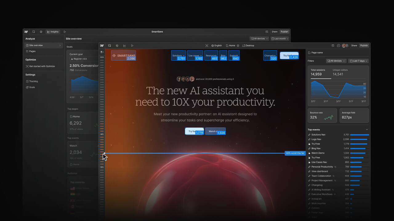
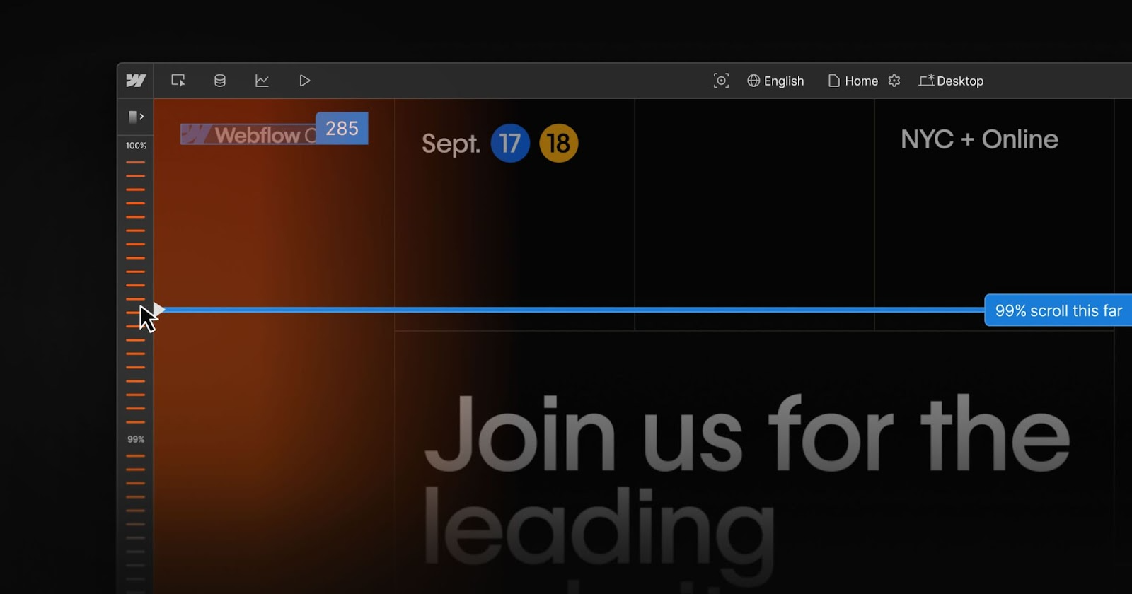
It also includes in-canvas visual analytics such as clickmaps and scrollmaps that overlay behaviour directly on the page layout. That makes it faster to spot UX problems like dead clicks or CTAs hidden below the fold.
Why Choose Webflow Analyze?
There are lots of analytics options. Webflow Analyze is not meant to replace a full analytics stack. It is built to remove friction and get design-led teams acting fast. In short, it gives context where you build, so you can turn observations into changes without extra wiring.
Here are a few reasons teams choose Webflow Analyze:
- Built into Webflow. You do not have to jump into a separate dashboard, hunt for element IDs, or wait for developers to add tags. Metrics and visual layers live in the same place you edit pages, so designers and content owners can spot issues and ship fixes faster.
- Automatic event capture. Common actions like form submissions, button clicks, and typical CTAs are often tracked automatically. That means you can start measuring conversions without a big tagging project, lowering setup cost and shortening the time from insight to action.
- In-canvas visual analytics. Clickmaps show hotspots and dead clicks. Scrollmaps and an average fold indicator show what portion of the page users actually see. Because these overlays appear on the page layout, it is easy to decide whether to move a CTA, shorten a hero, or turn a static image into a link.
- Designed for design and content teams. The UI and outputs are aimed at people who make pages rather than full-time analysts. Metrics are presented to suggest clear next steps, such as moving the CTA or shortening the form, which speeds up iteration cycles.
- Privacy-minded and compatible with consent tools. Webflow positions Analyze as a privacy-conscious feature and documents integrations and controls for consent, which makes it simpler to stay compliant while still gathering useful behavioural signals.
That said, Webflow Analyze complements but does not replace advanced analytics or session recording tools. You or your team would ideally use Webflow Analyze for quick, in-editor diagnosis and fast experiments. Keep GA4, Mixpanel, or session-replay tools like Hotjar or MS Clarity for deep funnels, cohort analysis, or full session playback.
Getting Started With Webflow Analyze
Setting upWebflow Analyze is extremely simple. Here’s how you do it -
Step 1: Enable the Analyze add-on
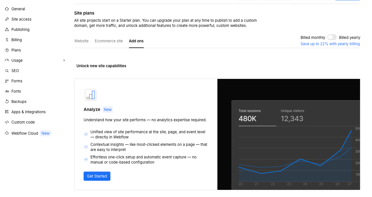
Analyze is a paid add-on that you enable per site. Open the site in Webflow, go to Site settings > Plans > Add-ons, and click Get started under Analyze. After purchase, it applies to that site only.
Step 2: Complete the purchase

Follow the checkout flow to buy Analyze for this site. Pricing is tiered (session limits/pricing are shown on Webflow’s Analyze page).
Step 3: Access the Analyze dashboard
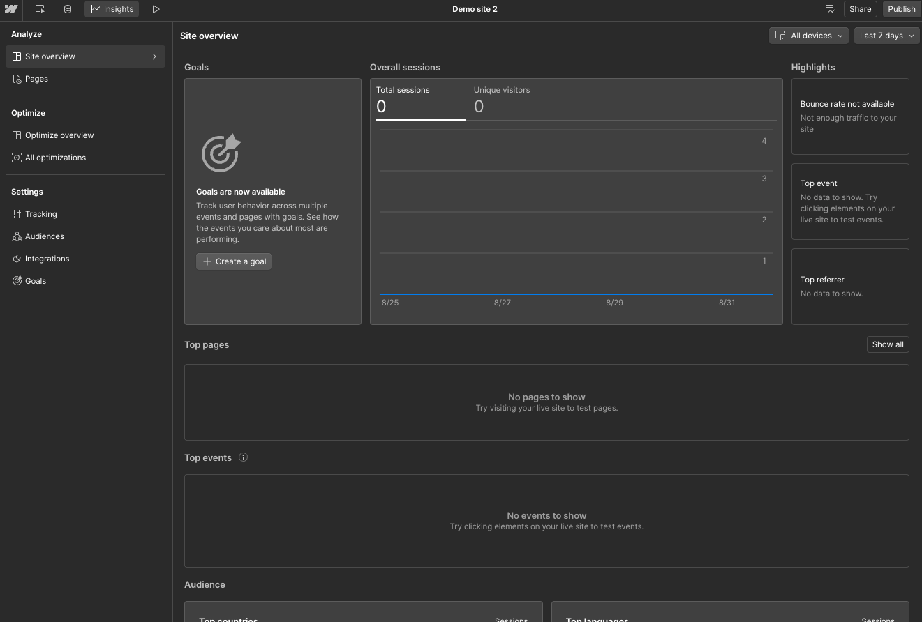
Once enabled, go back to your site and open Analyze in the top panel to see the site overview and page-level insights.
Step 4: Let data populate
Analyze starts capturing data automatically after activation. If your site is new or low-traffic, give it some time to collect meaningful signals.
Step 5: Define conversion goals
Decide what actions matter, for example, contact forms, pricing clicks, or newsletter sign-ups, and use those as your goals when reviewing performance. Webflow Analyze supports easy goal tracking and automatic capture of common events.
What metrics to focus on
Not every metric matters equally. Focus on a small set of signals that directly tell you whether visitors are moving toward your goals. Below are the three metrics groups to watch and what to do when each one looks off.
Traffic
This tells you how many people arrive and where they come from, which helps you judge intent. Look for channels that drive lots of visits but few conversions; that usually means the message that brought people in does not match the page they land on.
Pick one high-traffic source, update the landing page headline to match the campaign or search intent, and measure the change over a week.
Engagement
Engagement shows whether people actually read, scroll, or interact with your pages. Use scrollmaps and the average page fold to see how far visitors get, and clickmaps to spot dead clicks or missed CTAs.
If many visitors never reach your CTA, move or duplicate the CTA above the average fold for the most common device, then track whether scroll depth and CTA clicks improve.
Conversions
Conversions are the outcomes that matter, such as form submissions, sign-ups, and CTA clicks. Webflow Analyze makes it simple to track these goals and often captures common events automatically so you can measure results without a big tagging project.
Pick one goal on a priority page, change a single variable (button text, placement, or form length), and use the compare view to check lift after a week.
Using Webflow Analyze to Improve Conversions: a step-by-step guide
There are three reliable ways to use Webflow Analyze to improve conversions. Each one below is short, practical, and focused on a single outcome so you can act quickly without overthinking.
Spot underperforming pages
Use this when a page gets traffic but doesn’t convert. Here’s what to do:
- Pick a date range (7–30 days) and sort pages by traffic and exits. Pick 1–2 pages that get attention but have low goal completions.
- Open the page in Webflow and enable the clickmap + scrollmap layers. Watch for dead clicks, low scroll depth, or CTAs that are rarely seen.
- Form one clear, small fix, e.g., move the primary CTA higher on mobile, make a heavily clicked image clickable, or shorten the hero copy.
- Deploy the change and monitor the page’s goal completions and CTA clicks in Analyze over the next suitable period.
For example, if the clickmap shows users tapping an illustration in the hero, convert that area into a clickable demo link, and you’ll often see a near-instant uplift in CTA clicks.
Pro Tip: Fix one thing at a time. Tiny, obvious improvements stack into real gains.
A/B test landing pages
Use this when you want to learn what copy or design actually moves the needle. Here’s what to do -
- Choose a high-traffic page and a single primary metric (CTA clicks, form completions).
- Look for signals in Analyze that point to a hypothesis e.g. low time on page suggests headline or clarity issues; clickmaps show missed CTAs.
- Build one variation where you change the headline, CTA copy, or CTA placement, and run it via A/B tools like Webflow Optimize, VWO, or Optibase.
- Measure the primary metric in Analyze (use compare view) and decide: roll, revert, or iterate.
For example, test “Start free trial” vs “See pricing” CTA. Same placement, different promise. Often copy alone moves CTR.
Pro Tip: Prioritize tests on pages that already have steady traffic so results are meaningful.
Optimize content for conversions
Use this when blog posts or resources attract readers but don’t feed your funnel. Here’s what to do:
- Find top content by sessions, then check downstream clicks to product, pricing, or contact pages.
- Add a single conversion element in the content like an inline CTA, a short demo embed, or a contextual link, placed where the scrollmap shows readers reach.
- Promote that content in the same channels that deliver traffic (so the test has volume).
- Track how many readers follow the link and convert; refine CTA wording or placement if uptake is weak.
For example, a long how-to gets lots of traffic but few sign-ups. Add a short product demo after the first major section and a mid-article CTA to pricing, and watch downstream clicks for the month after.
Pro Tip: Put your main CTA where most readers actually reach. The scrollmap tells you exactly where that is.
Visual Analytics: Clickmaps & Scrollmaps (Quick Win Tools)
Webflow Analyze shows clickmaps and scrollmaps directly in the page context you’re editing. That makes it easy to spot misplaced CTAs, dead clicks, or content that sits below the fold for most visitors. These visual layers work without extra tagging and are great for fast, design-led decisions.
Wrapping It Up
Webflow Analyze gives you quick, in-editor insights that make it easier to test changes and measure impact. It’s not a replacement for a full analytics stack, but for designers and content teams who need to move fast, it’s a practical, privacy-minded way to start making data-driven improvements.
If you haven’t tried it yet, start small. Enable Analyze on one site, review the metrics each week, and make one improvement at a time. You’ll quickly see how data-driven tweaks like clearer CTAs or stronger content flow can translate into more sign-ups, leads, or sales.